Before describing how to design a logo for your business, it is essential to understand the purpose of the logo.
A logo is a symbol or mark used to represent your brand. You can think of it as your signature. Above all, the primary role of a logo is brand recognition. A good logo design will help your customers instantly recognise your business. Therefore your logo should be distinctive, clear and memorable.
How will you use your logo?
When designing a logo, it is essential to consider how you will use your logo. For example, will it be used digitally? Or will it be used in print? When designing for digital, you should consider that your logo will be visible at a very small scale. Such as favicons and menu logos.
Or perhaps you own a coffee shop, and you’d like your logo design printed on T-shirts. Understanding the requirements for embroidery is an additional factor to consider. For example, intricate designs with multiple colours won’t translate to t-shirt printing.
Consequently, these considerations have led to many businesses opting for minimal logo designs. This is because minimal design offers the most versatility across different uses due to its simplicity.
Research the competition
Before getting out your sketch pad, your first step is to research the competition. The aim is to review logo designs within your industry objectively. This process will help you to recognise effective logo designs, as well as ones to avoid. Finally, begin to sketch your concepts, ensuring they don’t mimic any of your competitors. Remember, the purpose is to create a logo that represents your brand. (Here’s a handy link to a guide on brand). Your research will help you to ensure your logo doesn’t blend in with the crowd.
Top tip – Avoid generic ideas
A common misconception is that your logo must show people what your company does. As a result, there are roughly 9 billion (not factually accurate) estate agents with a house in their logo. As a result, if you try to do the same, there are two significant risks to consider.
- Your logo will look just like everyone else’s in your industry
- You risk overcomplicating your design when making it look different from your competitors.
With this in mind, we should think a little more abstractly about logo design and avoid the obvious.
Remember, the purpose of a logo is to help customers recognise your business, not what you do.
Are you not convinced? Take a look at the UK’s most successful businesses. FTSE 100.
The 5 Types of Logo
When designing a logo, it is helpful to know that there are just five standard types of logo. Using these ‘types’ as a template will help you create a good foundation for your design.
Wordmark
A wordmark is a freestanding word or words. Logotypes are uniquely styled text logos that spell out the company or brand name in a stylised typeface.
Letterform
Letterform is a symbol representing the company through the use of its initials. These marks are exclusively typographic.
Abstract
Abstract marks are a symbol that conveys a big idea in an interesting shape. Abstract marks are highly conceptual, they might represent an idea or value rather than provide a direct message.
Emblem
An emblem is a mark in which the company name is inextricably connected to a pictorial element. What differentiates them from other brandmarks is that the elements are never isolated.
Combination
As the name suggests a combination mark involves a combination of wordmark and brandmark.
Colour Psychology
Colour can impact our emotions and behaviours. Don’t believe me? Here’s a study by Frontiers Media. Choosing the right colours for your logo helps you to begin to communicate your brand with your customers. Conversely, something as simple as a poor colour choice can lead to a confusing and forgettable brand.
Colour psychology is an entire topic of its own, so I won’t attempt to describe the impact of each colour. However, if you are interested in learning more, check out this blog by Orbelo.
Colour Theory
If you plan to use more than one colour in your logo, a solid understanding of colour theory will help you make the right choices. Colours don’t all work well together, so it is essential to take your time in selecting your colour palette.
A colour wheel is a great tool to help you choose your logo colours. The colour wheel contains warm colours (red, yellow, orange) on the left side and cool colours (blue, green, and purple) on the right.
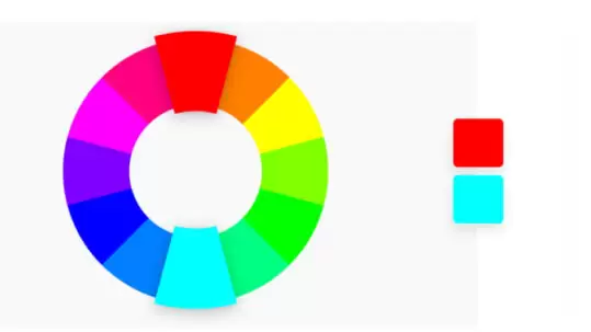
Complementary colour combinations are colours opposite of each other on the colour wheel, these create contrast.

Analogous colour combinations are typically three to five colours next to each other on the colour wheel. These combinations tend to lead to harmony and balance.

Triadic colour combinations are colours that are evenly spaced around the colour wheel.
If you’re not sure where to start in creating your brand’s colour palette, there are some great online tools to help you. You can either start searching with a colour in mind or let the tools suggest some for you.
How many colours should be in a logo?
Early in this article, we have already established that simplicity wins, so one to three colours is optimum for a great logo design. However, an old fashioned rule that still holds weight today is that your logo should be recognisable even when shown in just one colour (black or white). This was as traditional printing only allowed for one colour to be produced.
Typography
Like colour, font choice also impacts the perception of your logo design, so it is critical to find the right one. But with thousands of fonts available, how do you find the one that’s right for you?
Start by deciding what font style is for you. There are only four primary font styles; these are:
Serif
Serif fonts have small decorative or embellished lines added to each character (or letter).
Sans-serif
Sans-serif means without serifs. They do not contain embellishments.
Script
Script fonts are designed to mimic calligraphy and traditional hand lettering.
Sans-serif
Sans-serif means without serifs. They do not contain embellishments.
If you are struggling to find a font that represents your business, it is possible to have a custom font created for you. This is typically an option for large companies due to font design’s time and cost implications. However, the investment gives you a unique identity that your competitors can’t replicate.
Symbols
Symbols can be pictorial and literal (like a house or a tree) or geometric and abstract (like a square or spiral). Let’s remember the purpose of our logo, ‘to help the customer identify your business. Your symbol should be unique to your brand, so try to avoid the obvious.
Summary
Finally, we all know the Nike swoosh. McDonald’s golden arches and Mastercard’s overlapping circles. You could ask anybody to recreate any of these logos from memory, and 99% of people could. How? Because of the simplicity of the design and repeated exposure through brand awareness.
Hopefully, this guide has given you the tools to develop your logo. Or to be able to ask your designer the right kinds of questions. If you’d like to learn more about logo design or need some professional support, the Reach team are on hand to help.

About the author
Did you find this article useful? Share it with a friend or colleague