
STAND2 / CASE STUDY
Let’s talk
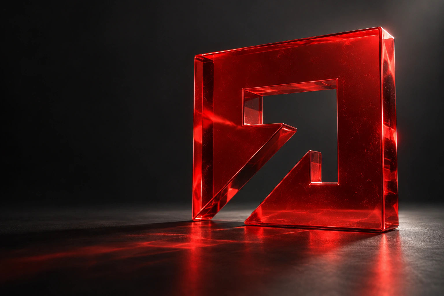
A sculptural interpretation of Stand2’s arrow mark in translucent red glass
REACH DIGITAL × STAND2BRAND / DIGITAL / DEVELOPMENT
A NEW CHAPTER
FOR STAND2

Forward.With confidence.

A bold new identity and digital experience
for a brand that builds confidence in others.

Explore the project
THE DIRECTION IS CLEAR. ↗
01 / THE SHIFT

The confidence was there.
We made it visible.

CLIENT
Stand2
INDUSTRY
Specialist training
& development
THE COLLABORATION
Brand identity
Brand guidelines
Website design
Website development

When your work is about helping people handle pressure, your brand should feel assured. Clear. Ready for anything.

Stand2 equips people with the skills to manage conflict and stay safer at work. Reach brought that expertise into sharper focus with a new identity and a completely redesigned website.

One connected system, from the character of the wordmark to the way someone finds the right training. Designed to make a strong first impression — and hold it.

02 / THE SYSTEM

Distinctive by design.
Confident by nature.

A directional mark. A purposeful palette. A voice with clarity. The foundations of a brand built to be recognised.

STAND2 / VISUAL IDENTITYBUILT TO MOVE FORWARD
Stand2
A CLEAR SENSE OF DIRECTION.
A VOICE THAT MOVES YOU.
Clarity.Confidence.Control.
CALM. CAPABLE. CONFIDENT.
THE MARK, IN MOTION.
Stand2 Red#EA1811
Dark Grey#111111
White#FFFFFF
01 — THE MARK

Direction, with purpose.

The arrow gives the identity a natural sense of progress. A recognisable device that can lead a layout, frame a message or move through a screen.

02 — THE EXPRESSION

Strength in simplicity.

Bold red. Grounded black. Clean white. A focused palette and clear typography keep the brand direct, recognisable and easy to apply.

03 / IN THE WORLD

A brand you can feel.

Exploring the identity beyond the screen, through tactile materials and bold environmental graphics.

FROM FIRST PRINCIPLES.

The craft behind
the confidence.

The original identity film and brand guidelines bring the thinking into focus: a carefully considered wordmark and a system for using it consistently.

THE ORIGINAL BRAND FILM00:24
THE BRAND GUIDELINESOne consistent language
BUILT FOR CONSISTENCY.

A system,
not just a signature.

Logo, colour, typography, imagery and everyday applications. Clear foundations that connect every part of the brand.

04 / THE EXPERIENCE

One identity.
Every viewport.

We took the brand’s new confidence online.
Clear journeys. Purposeful motion. Every detail connected.

Explore Stand2
DESIGNED AROUND PEOPLE.

A complex offer.
A clearer journey.

The new site gives Stand2’s training a clear structure. Strong hierarchy and defined routes help visitors explore programmes, sectors and delivery options with confidence.

01

Brand, translated into behaviour.

02

Clarity at every touchpoint.

03

Consistency across every screen.

THE VISION, REALISED.

From concept.
To code.

A closer look at the design and the finished website. The same attention to detail, all the way through.

DESIGNED WITH INTENT. BUILT WITH PRECISION.00:48
THE RESULT

Stand2.
Standing stronger.

A distinctive identity. A coherent brand system. A considered digital experience. Together, they give Stand2 a presence that reflects the confidence it builds in others.

01

A recognisable identity.

A confident mark and a focused visual language.

02

A connected brand.

A consistent expression from materials to screens.

03

A clearer digital home.

A responsive website that brings the whole story together.

YOUR NEXT CHAPTER STARTS HERE.LET’S MAKE IT COUNT.
Your move.

Brand. Code. Creative. Growth.

info@reachdigital.media